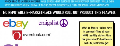
More than one month after Healthcare.gov was launched, trouble has plagued the website. The high volume of visitors exposed many of the website’s capacity and software weaknesses. The following infographic quantifies the shortcomings and glitches that caused the thumb down of the public.
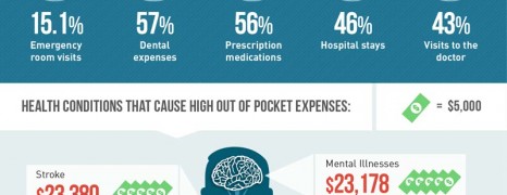
Medical Debt in the US
visualized by: National Debt Relief
Unpaid medical bills are now the leading reason Ameircan households are scrambling. What’s the cause of medical debt inflation?
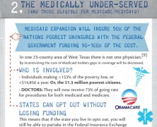
Obamacare Specifics
visualized by: Top RN to BSN
Almost 6 out of 10 Americans either are unaware or have an obscure idea of the obamacare act specifics. This report gets down to the aftermath both for businesses and individuals.
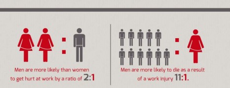
Work Injury Hidden Costs
visualized by: SafetyVideos.com
Lost wages, lost productivity, uncertainty for the future are some of the issues both employers and employees are met with after a severe work injury incident. However, the vast majority doesn’t realize the true costs associated with someone getting hurt while working. Here is you get an interesting look at what type of employees face the most danger in the field and the financial impact of getting injured has on an employee.
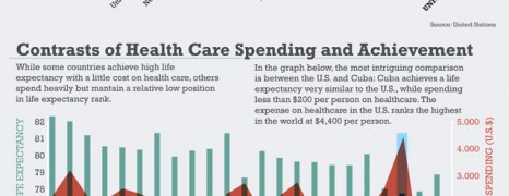
Healthcare Spending vs Life Expectancy
visualized by: Marco Giannini
Contrary to the common sense, life expectancy rates are not proportional to the spending for healthcare services in many countries. US proves to be the worst perfomer regarding this analogy while other countries with limited funds and less industrialized achieve more.
US Veterans Have No Health Insurance
visualized by: rwjf.org
Give and take is a controversial íssue sometimes. 1.3 million veterans are restricted from health insurance.
")