
You will be amazed by the magnitude and variety of the music genres that define rock music. Take a journey into the rock history through the decades and learn about the origins and associations of almost all genres that have emerged the last 100 years.

Online Video Drives Sales
visualized by: WyzOwl
Available both in static and motion version, this infographic pinpoints 6 key findings regarding the effectiveness of online video marketing to the narrow edge of the sales funnel.
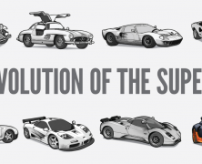
Supercar History
visualized by: Neo Mammalian Studios
Neo Mam studios show its excellence in creative design utilizing parallax technology to present the major machines, from the legends to the present beasts of the road. Eight of the most amazing supercars are waiting you to play with.

Indoor Air Pollution Facts
visualized by: airfilters.com
Reportedly 1 death per 8 seconds is attributed to indoor air pollution due to primitive cooking and heating methods mostly found in developing countries and poorest populations. People from Airfilters.com aim to rise awareness about this situation that affects almost 50% of the global population with this highly creative motion and static infographic .
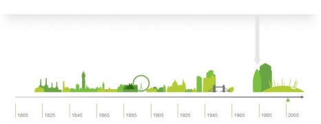
London Sites History
visualized by: Render Positive
A look at the changing London skyline with interactive timeline bar from 1805 to 2018 that shows the past, present, and future of popular London buildings and constructions. Here you see the static version. Click the publisher’s link on the left to reach the interactive version.

Men vs Women Driving
visualized by: vogmedia.com
This motion infographic with a pretty uplifting tune in the background, addresses the agelong wrangle between men and women drivers. Have you ever concluded which of the both sexes performs better in driving? Brit men and women are contesting for the first place based on 3 typical criteria. Follow the link to see the static version if you like.

Drugs in Pregnancy Statistics
visualized by: 12palmsRecoveryCenter.com
People from 12 Palm Recovery Center present with this nifty video adaptation of their primary static infographic the brutal picture of American pregnants addicted to drug abuse and the detrimental consequences of drug and alcohol intake during pregnancy both for moms and the newborns.
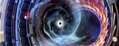
LHC CERN Big Bang Big Data
visualized by: CERN IT department
CERN hosts 4 of the biggest, most complex and momentous experiments in the world history. LHC (Large Hadron Collider) is one of the 4 and outputs a whopping total of 1 petabyte/sec data. Without the proficiency of united IT geniuses around the world this data would never enter the pipeline. Watch an impressive animation that represents how CERN’s big data are collected, processed, recorded and distributed.

Chemistry of Love
visualized by: Mitchell Moffit & Gregory Brown
Common perception associates love with heart. But love is actually hitting our brain before making our heart beating like a hammer. Asap Science presents the biological background of love in an effort to explain the unexplained.

Chicken or the Egg Paradox
visualized by: Mitchell Moffit & Gregory Brown
The agelong question that itches the folks about the egg or chicken first coming is finally answered in a funny and scientific way. Enjoy!

Rolling Stones Concerts History
visualized by: Github.com
Great interactive mapping representing the Rolling Stones legendary concerts’ route around the globe throughout their 50 year history.

Credit Crisis Simplified
visualized by: Jonathan Jarvis
For you people that you experience and feel the downturn resulting from the so called credit crisis, here is the simplified version of what happens in the mortgage market and how brokers, banks and investment institutions are creating financial bombs. Creativity in its excellence-this presentation wins an A+ grade.

Online Video Marketing Stats
visualized by: mysocialagency.com
Video is the universal language of the web and fairly the most engaging type of content. My Social Agency made this nice presentation to show the magnitude of online video production and sharing today and to highlight its marketing potential for tomorrow.

YouTube Video Revolution
visualized by: James Wedmore
James Wedmore gives us a holistic view on the latest YouTube statistics, documenting the rise in video content as a herald of its domination in the internet world. People love watching rather than reading.

Child Labor in Philippines
visualized by: Francin Cruz
Frustrating facts about child labor have been published from International Labour Organization showing that more than half of the working Filipino Children are in hazardous child labor.

Fast Food Facts
visualized by: Infographics Show
Really impressive facts about the fast food industry. Just some highlights of what you’ll watch are: Americans are champs in calorie intake, 248 000 die prematurely due to obesity, 75% of Mc Donalds sales are made up by customers with 10 time monthly frequency.

Web evolution timeline
visualized by: Vizzuality & Hyperakt
Absolutely interactive, handy and informational infographic showing the history of the internet in a nutshell. Includes selection option with separate screens referring to browsers – technologies and the general history.

Digital Music Distribution
visualized by: James West - Len Henriksen
Astounding animation and sound mixing in an effort to illustrate the current state of digital music consumption, our listening habits and the impact on artists and music industry.

Blood Donation Saves
visualized by: Vericom.net
Who doubts that blood donation is a social responsibility? It counts knowing that you can save a fellow’s life with just 1/3 of a pint!

We are all Water
visualized by: Infographics Show
A great infographic that reminds us the importance of water in our living and its contribution to the planet’s ecosystem.