A guide for new investors, showing them how buying physical gold can diversify their portfolio and serve as a safe long-term investment. The infographic features popular reasons for purchasing gold, the benefits of owning gold, and several “frequently asked” questions.
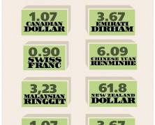
What a Dollar Buys
visualized by: master-of-finance.org
Economist published “The Big Mac Index” a lighthearted approach to analyzing the difference between actual prices and exchange rates. Starting from this, here are some updated stats on the cost of the Big Mac in different countries and, for comparison, what 1 US dollar can get you.
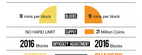
What to Know about Namecoin
visualized by: Neo Mammalian Studios
Although Namecoin was mainly created to be used as a decentralized Domain Name System, it has turned into a big cryptocurrency. Let’s have a closer look at this virtual currency and its differences from bitcoin
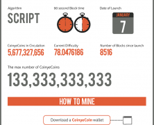
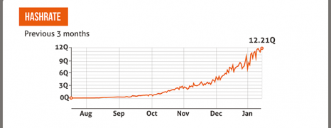
Coinyecoin 101
visualized by: Neo Mammalian Studios
If Coinye’s history has made you curious from the beginning, here are some interesting facts about this original altcoin.
Novacoin vs Bitcoin
visualized by: Neo Mammalian Studios
Cryptocurrencies are here for good. Likely you have heard of Bitcoin. But what about Novacoin ? Meet Novacoin, one of the biggest phenomena in the world of cryptocurrency.
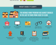
Home Insurance 101
visualized by: Lending Expert Blog
This infographic presents some interesting stats and facts about home insurance industry and serves as a basic guide for homeowners who need some help in choosing insurance plan and company and want to avoid involved pitfalls.
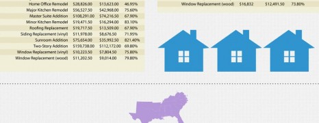
Home Remodeling Cost vs Value
visualized by: BRIM Agency
How much value could a home remodeling project add up to a property in the US ? Here you see comparison tables for average cost and resale value on national and regional scale based on prices of 2013.

Consequences of Low Credit Score
visualized by: Ghergich&Co
Ignoring your credit score could bring you against unbearable costs. Have a look at the consequences that result from overlooking regular credit score review.
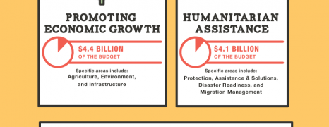
US Foreign Aid 2012
visualized by: nowsourcing.com
Does the US government offer substantial financial aid and support to the “weak” or just throw crumbs to whitewash its image and manipulate nations ? See a breakdown of the US foreign aid as of 2012 and how it stacks up against the total U.S. budget.
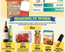
Bulk Shopping Tips
visualized by: Cheap Online Degrees
This infographic sheds some light on the ins and outs of bulk shopping in an effort to draw some conclusions about the final benefit.
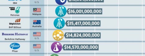
Most Profitable Companies 2012
visualized by: Accounting School Guide
Contrary to the unstable economic context, there are evident signs of companies from all around the world hoarding. Here you see 25 of the most profitable companies worldwide as of 2012 and following to that 6 American companies that “missed” the taxation path.

RDS vs EGWP
visualized by: EGWPInfo.com
RDS stands for Retiree Drug Subsidy while EGWP for Employer Group Waiver Plans. EGWP have a number of tax and administrative benefits that plan sponsors and brokers cannot ignore. This infographic explores the major differences in plan options for retiree pharmacy benefit plans.

Economic Development in Africa
visualized by: International Business Guide
Numbers show that Africa is steadily gaining ground in the global business landscape with evident signs of striking economic development in 6 sub-Saharan countries including Congo, Kenya, Uganda, Rwanda, Ethiopia and South Africa. Educational advancements and improvements to infrastructure have been proved instrumental to this big shift.
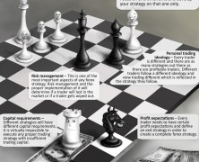
Forex Strategy Tips
visualized by: PaxForex
For you people in the world of finance here are some key factors you should consider while planning a successful forex strategy for maximizing profits.
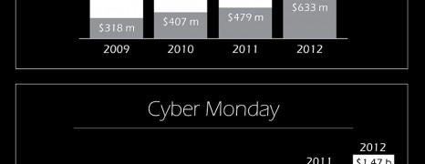
Black Friday Spending Trends
visualized by: accounting-degree.org
Do you know the origins of the term “Black Friday” ? Get the answer here packed with some online spending trends for the most dashing shopping days of the holiday season for 2009, 2010, 2011, 2012 and forecasts for 2013.
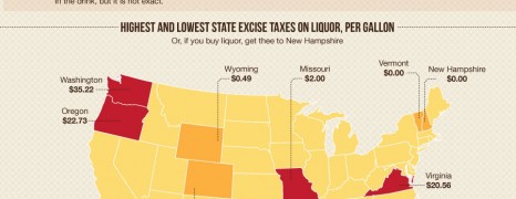
Excise Tax in US History
visualized by: Accounting School Guide
Do you have any idea of how much we shell out on taxes for pleasure products like alcohol, cigarettes, gambling and marijuana? Let’s see how much we would save from tax excise if government was less greedy with our pocket and learn from the the tax history in the US.
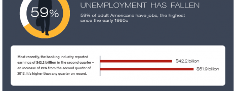
American Workaholics
visualized by: numbersleuth.org
Most Americans spend more time on the job than they do on anything else according to the data presented here. It is estimated that American workaholics are occupied about one month more per year now than they did 40 years ago. Does that ring true with you?
Federal Reserve After Bernanke
visualized by: timothysykes.com
Have a look at this brief of Ben Bernanke’s legacy throughout his tenure as chairman of the Federal Reserve and get to know the 4 most prevalent of Ben’s successors.

Best Countries for Business 2013
visualized by: International Business Degree Guide
Seeking for business opportunities to invest? This infographic has it all. Find out which countries around the world retain the economic context that can help a new business to flourish in this moment of recession recovery.
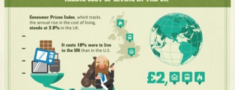
Cost of Living in UK 2013
visualized by: Neo Mammalian Studios
Get a picture of wealth distribution among UK residents and the impact of inflation on the purchase power of 1 million pounds and real estate market over the last 20 years.