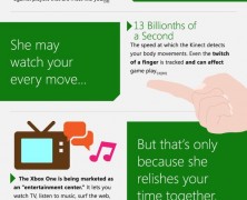
She’s controversial, a bit steep and, sometimes, even kind of obsessed… But she’s still confident you will learn how to love her. We are talking about the Xbox One, your new clingy girlfriend you cannot date before November 22nd.
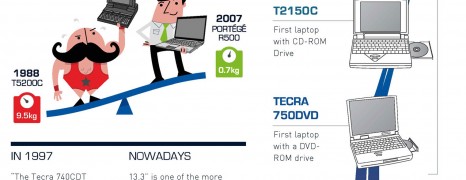
Toshiba Laptops Milestone
visualized by: Toshiba
Toshiba celebrates 10 million sold laptops milestone with this retrospective presentation of the fascinating changes over them and shows some nice and sparkly information on how many laptops 10 million really is!! Comparisons show clearly the progress that has been made as far specs and design in portable computing.
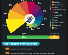
Addicted to Apps
visualized by: Graphs.net
The infographic is based on the most used and addicted apps for mobile, based on the research done by the MTV and other sources to know the rate of addiction of people for Applications.
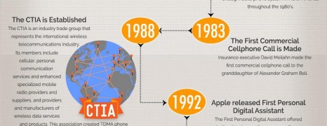
Mobile Technology in Business
visualized by: SwitchPay
Walk through some of the biggest moments in the development of wireless and mobile communication technology and discover how it has revolutionized the way small to enterprise size businesses operate on a daily basis.
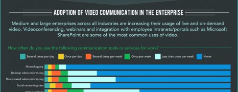
Corporate Video Conferencing
visualized by: KickStart Search
Even more enterprises are adopting video technologies for their communication needs. From internal communication for distance collaboration and conferencing to customer-centric video services, audiovisual communication considerably abets employee engagement. Read the facts.
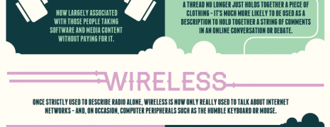
New and Old Tech Terms
visualized by: Lebara UK
The future of technology has altered the words we use on a daily basis for years. Here is a look into the future, and how tech might change our language further.
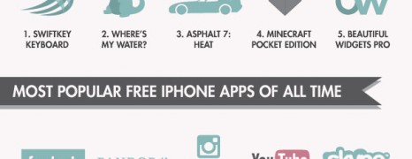
A World of Apps
visualized by: Insurance2Go
App Store becomes already five and and this graphic comes to resume how the two smartphone app giants perform in popularity for paid and free apps and revenue. Following to the statistic part you will find 8 key factors that make an app great.

Men vs Women Driving
visualized by: vogmedia.com
This motion infographic with a pretty uplifting tune in the background, addresses the agelong wrangle between men and women drivers. Have you ever concluded which of the both sexes performs better in driving? Brit men and women are contesting for the first place based on 3 typical criteria. Follow the link to see the static version if you like.
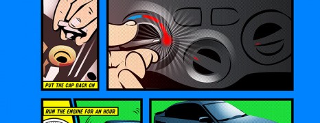
Head Gasket Repair Guide
visualized by: Steel Seal
Though we wouldn’t typically identify this as an infographic and contrary to our policy against commercial direct content, we decided to showcase this graphic as it worth the try to see how it looks when a business decides to “speak” the product in a really creative and outside of the box manner. Delve into your cars mechanics and do some fixing.
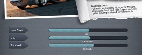
The Fast and The Furious Cars Specs
visualized by: Neo Mammalian Studios
Can you feel the smell of burned tires? It’s coming from this infographic, which features the best cars from “The Fast and the Furious” series with modifications, typical performance benchmark and film sequel affiliation.
Things to Know About Cars
visualized by: Neo Mammalian Studios
You will surely find things you didn’t know about cars among these 50 of the pickiest facts referring to car history, prices, brands, technology and stories from around the world. Are 50 enough? We bet you’ll be amazed by them… We’re talking about our new infographic, with the best fun facts about cars.
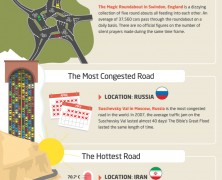
Roads to Avoid
visualized by: Neo Mammalian Studios
Here are the worst roads in the world that you can imagine picked and commented by Car Finance 247. Even on a 4X4 you would literally wish to have a pair of wings to spead. Our infographic details the world’s worst roads.

US Wiretapping History
visualized by: Who Called My Phone
Chances are that you have heard or read about the story of Edward Snowden and the hullabaloo that his rattling statements fired. Here you will learn all the story about American wiretapping as part of the never ending and ambiguous dilemma of privacy vs security.
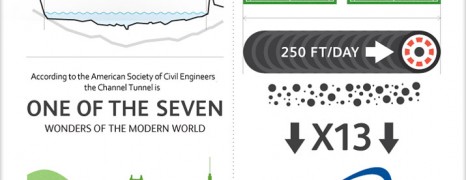
The Chunnel Marvel
visualized by: OMD UK
20 years ago, undersea commuting between France and the UK was a vision and construction challenge to pursue for both ends. Now that the channel tunnel has become a reality, the vast majority takes for granted this engineering feat. Read the numbers behind the tunnel straight from the constructor’s mouth.
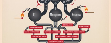
SAP Data Archiving Benefits
visualized by: KickStart Search
Together with the big data boom comes the case of data archiving. Dolphin, as a SAP specialist, presents the big picture of data management in ERP systems as a prerequisite for high performing corporate operations.
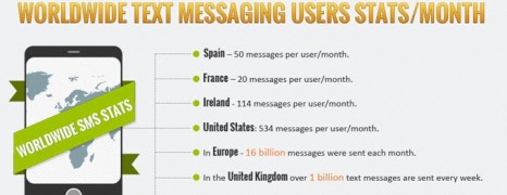
Text Messaging Evolution
visualized by: Graphs.net
Since when do you remember yourself tapping the keypad on the go? If you don’t belong to the mobile tech veterans, it worth to know that the first ever sms text message was delivered just a few days before 1992 closing. See how it all started and how we have reached to talk about the SMS lingo.
Traveling on Cycle
visualized by: Neo Mammalian Studios
Miles and miles of fun. That is just one of the things bicycle riding can provide. However, keep in the back of your head the possibility to use your bike for touring around some of the most cycling-friendly countries that have to offer enchanting biking moments. Find all you need on this “cyclographic”.
The World on Mobile
visualized by: Lebara UK
People from Lebara UK, sourcing data from the UN and PEW, visualize the worldwide mobile usage across 18 different countries from Europe, Africa, Middle East, America and Asia to show us how the world utilizes mobile technology to communicate.
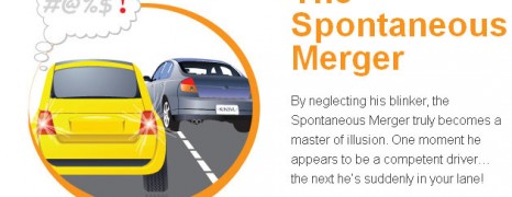
6 Dangerous Drivers
visualized by: IdriveSafely.com
No matter where you go, you will find them everywhere. In your lane, in your parking space, and in your way. If you can’t steer clear of these senseless drivers, then sooner or later, they’re bound to run into you!
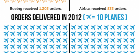
Battle in the Skies
visualized by: Lisa Mahapatra
Don’t take it literally. This infographic refers to the everlasting rivalry between the two aeronautics’ giants from the both sides of the Atlantic. American Boeing or European Airbus gets the lion’s share?
")