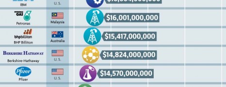
Contrary to the unstable economic context, there are evident signs of companies from all around the world hoarding. Here you see 25 of the most profitable companies worldwide as of 2012 and following to that 6 American companies that “missed” the taxation path.
Employee Fraud Statistics
visualized by: BestAccountingDegrees.net
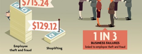
Employee fraud and theft consists a vital setback for the operations and development of a business or organization. According to the statistics presented here, employee dishonesty and snaffling costs a total of $2.9 trillion in global scale losses per year.

NFL Billion Dollars
visualized by: Finance Degree Center
With this report you get an overall view of how the business behind NFL works to make dollars with little to no return to revenue authorities through the taxation system.

Corporate Tax Evasion UK
visualized by: Render Positive
This report brings up for discussion the corporate tax evasion case in the UK as a major issue for the British economy. Three of the world’s giants are put under the microscope. Guess which.

Google Money Machine
visualized by: bestaccountingschools.net
Discover how the web giant has evolved to global tech mentor with a variety of verticals and projects where from pumps billions of bucks.

Best Airlines 2013
visualized by: TRAVEL CENTER
Quite obvious. Here you see the 10 best ranking airlines across the world according to world airline awards 2013. Emirates, Qatar and Singapore Airlines win the 3 leading positions respectively, but which ones follow?
Battle in the Skies
visualized by: Lisa Mahapatra
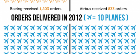
Don’t take it literally. This infographic refers to the everlasting rivalry between the two aeronautics’ giants from the both sides of the Atlantic. American Boeing or European Airbus gets the lion’s share?
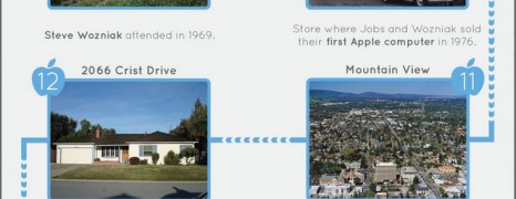
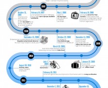
Tracing Steve Jobs
visualized by: Neo Mammalian Studios
Retrace Steve Jobs life-path in California and some of the Apple’s milestones with this special route map.
Gmail History
visualized by: Google
Gmail has already 9 years of history and though still in High School age, has managed to gather hordes of users offering basic and advanced communication features. Have a look at some highlights from the Gmail evolution.
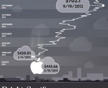
Apple Falling
visualized by: MoneyChoice.org
Here we are not talking about Newton’s apple and the gravity thing. It’s evidently about the Apple tech giant and its potential to defy gravity coming from its rivals especially after losing Steve Jobs leadership.

Canon vs Nikon Market Share 2010
visualized by: Graphs.net
Canon and Nikon together with Sony and Samsung are the most robust companies in the camera market. This infographic presents a timeline of Nikon and Canon milestones and shows how they stack up in sales by region for 2011 and in market share for 2010.
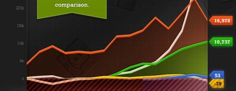
Tech Companies Profits 2012
visualized by: Staff.com
Five of the most popular tech giants (Apple, Microsoft, Amazon, Google, Facebook) are contesting in a dollar runrace. See how they have performed historically till 2012 as for revenue, profit and market caps.
Samsung Apple Clash
visualized by: MBAOnline
The never ending battle between the two tech giants goes up. See how Samsung stacks up against Apple as for revenue, work force, research and development, sales and of course profit.
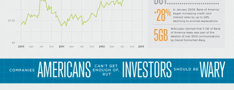
Good and Bad Companies
visualized by: nowsourcing.com
See the 3 companies that Americans love but investors look with a frown face against the ones that investors find good to put their money on but Americans have reasons to be wary.
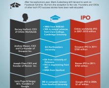
The Facebook Ipo
visualized by: Quin Street
Really big numbers. Mr. Zuck’s majesty worths more than you can imagine and will keep rising.
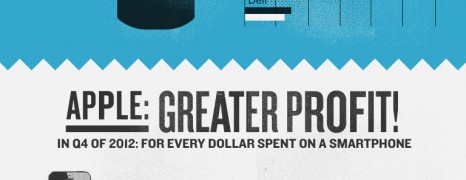
How Big Is Apple?
visualized by: Doctor Who?
The biggest apple in the world that yields 128KKK revenues. The most inspiring technology deserves the greatest figures.
Google Finance
visualized by: Masters in Finance
A sneak peek at the revenues, costs, expenses and profit of the Google empire. Offering free products while extending expenses doesn’t necessarily means you end up with red ink.
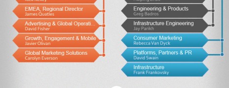
Facebook and Google Structure
visualized by: Graphs.net
Meet the white collars of the two internet giants. A graphical representation of Facebook and Google company hierachy structure depicting the the roles, departments and relations.
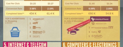
Google Advertising Revenue
visualized by: Wordstream
Let’s go deep deep down the Google sales funnel and see how much bucks its advertising model yields on daily basis. Following are key metrics of the top 10 industries that bid for the front.
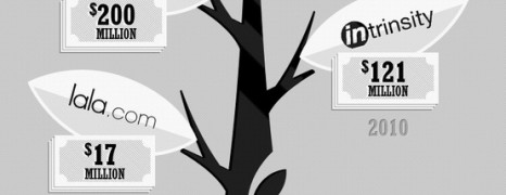
Tech Giants Acquisitions
visualized by: Time Doctor
Only 18 countries have GDP that exceeds Apple’s 5 billion market cap, which is worth more than Microsoft, Google, Facebook and Amazon combined. Have you ever wondered what Apple, or any of these tech giants, did with all these money?
")