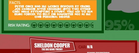
If this was a contest, wouldn’t you like to know who the biggest and most famous uninsurable drivers are? MoneySuperMarket compiled this graphic to highlight the top 5 TV personas that evidently screw it up when it comes to driving.
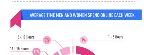
Internet Usage by Gender 2012
visualized by: BroadbandExpert.com
1029 adult respondents disclose their perception of internet usage as part of their day routine, how they prioritize various common activities and how they spend their time online.

Anatomy Of A TV Commercial
visualized by: voices.com
Break for commercials! We love them, we hate them. One way or another it’s a whole industry and here are the numbers for the US market.
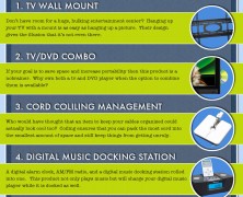
Time To Get Organize...
visualized by: bundlecity.com
Who loves that mess? Some useful tips to help you add subtlety to your device setup and be a proud housekeeper.
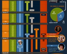
Doctor Who Timeline
visualized by: cabletv.com
The notorious Who! Starting from 1963 till today and covering 26 seasons so far, this is the timeline of the actors starred in the most classic role ever.

HDTV Connnection Guide
visualized by: YTD
An instructional infographic for HDMI connection between your TV and other devices such as iPhone, iPad, Android phone, MacBook, and Windows laptops to make your shots loom before your eyes.

37 Years Of Saturday Night Live
visualized by: cabletv.com
37 and counts! This is the history of the most popular and longlasting primetime TV show.
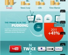
Youtube Killed Tv
visualized by: Freemake.com
VIva You Tube. The chronicle of the rising of digital TV, the domination over major US nettworks and the slow down of tv advertising market.
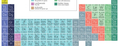
Periodic Table Of Tv Shows
visualized by: Doctor Who?
What’s the relation between chemistry and some of the most popular TV shows?
Social Media & Traditional journalism
visualized by: Schools.com
Our new digital habits have radically changed the way and the speed the information circulates. Social media are gaining more popularity as news source and journalists deal with obsolesce. But what’s going on in terms of trustworthiness and accuracy? Distributed reporting seems to be the next challenge for the news industry.
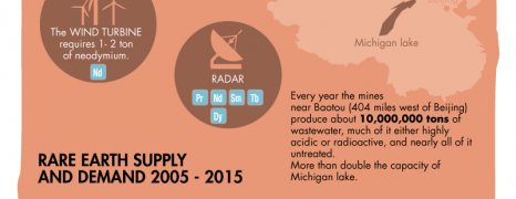
Rare Earth Metals industry
visualized by: Buckyballs
They sound valuable due to scarcity but that’s not truth. Rare metals are feeding the high-tech blossom. Now it’s obvious how the story goes…
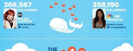
Which New Shows Have The Top Tweeters
visualized by: Networked Insights
Learn about the twitter popularity of the new shows announced by the top 5 netwoks late in May 2012.

The economy of Disney
visualized by: Jonathan Reyes
In this cool video infographic you can see the timeline of the Disney empire from 1929 to the present.
")