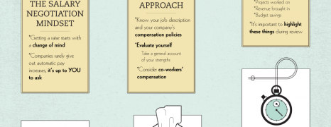
It’s time we talk about money. Your money! Do you find yourself kind of restrained or weak whenever you think of negotiating a raise? This infographic from GradSchoolHub came to learn you how to do it!
Workplace Complaints
visualized by: eJ4.com
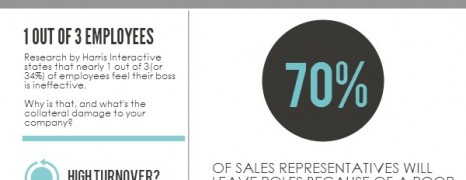
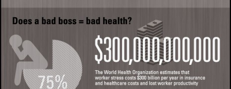
Is everything fine at work ? Are you seeking the missing employee complaint box? According to this report by eJ4, 1 in 3 employees have something to declare about their superintendent. Guess what.
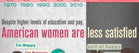
Working Women in America
visualized by: GreatBusinessSchools.org
American women are working hard and are feeling quite saddled in their effort to effectively respond to both motherhood and career duties, with most of them having limited options to choose a single role. But what mostly pains is the fact that contrary to their feministic feats, modern women are unhappy and less satisfied.
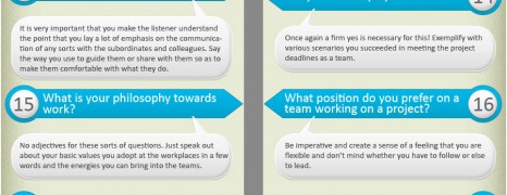
Job Interview Questions and Answers
visualized by: Graphs.net
A job interview might sound intimidating especially when it’s the crossroad for heading to your dream job and paving a sheer career path. Find a list of 35 common and devious questions a recruiter would ask you along with some tips. Get prepared to win!
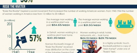
American Women Workers
visualized by: Jessie Fadayel
This infographic illustrates the changes occurred in women workforce during WWII and the present state of women in manufacturing. According to recent survey, a whopping gap of 600,000 skilled workers has been recorded, waiting to be filled by unemployed and qualified women.
Dirty Office
visualized by: BestChoiceReviews.org
It is estimated that the average worker is exposed to 840,000 germs every 30 minutes. Keeping clean and healthy in the office may be harder than you think.
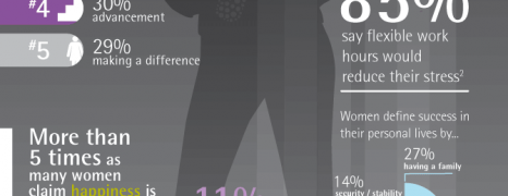
Happy Working Women
visualized by: Accenture
What defines success for women in the modern working environment and what motivates them more? Money or inward stability? Accenture worked on this and gives us an idea of what makes women happy.
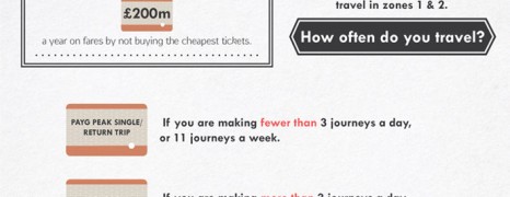
Saving on UK Commute
visualized by: Neo Mammalian Studios
The average annual cost of commuting to work in the UK consists a considerable portion of a Briton’s median salary and it is estimated around £1,775. See how you can save money on your commute.

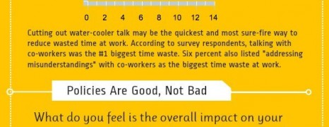
Kill the Time Killers
visualized by: OfficeTime.net
According to an OfficeTime.net survey the average amount of dawdling time at work ranges between 1 and 2 hours per day. The best way to fight something is to know it. Learn which are the most common time killers, what type of time waster you are and how to start fixing this.

BYOD Security Issues
visualized by: Orange
How safe is the common practice for employees to Bring their Own Device into work? Using our own devices at work likely delivers the best combination of personilization, easement and professionalism while studies are indicating benefits to employee engagement. Can companies tap into this trend without risking their network security? Read to learn more.
You and Your Boss
visualized by: Quin Street
Are you happy with your boss? Would you use his portrait for target training with your pins? No matter what’s your case, WorldWideLearn presents an illustrated version of workers’ job and boss perception survey conducted by Tell-Your-Boss.com.
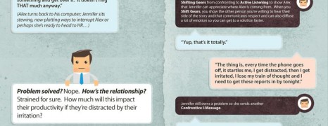
Dispute at Workplace
visualized by: GordonTraining.com
Getting things done as you want or as you ought at workplace, necessitates subtle communication skills when arguing with colleagues. This graphic collates two totally different communication approaches for the same situation based on a commonly met office-conflict scenario.
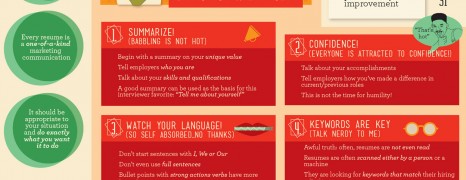
Effective Resume Writing Tips
visualized by: nowsourcing.com
Learn how to survive from the cruel job market competition by writing a resume that stands out from the stack and gets the most hits on the job boards.
Time Wasters at Work
visualized by: Track Via
C’mon we know we all do it to some extent. Contrary to what employers would expect, social media distraction at work is not the leading cause for time wasters. According to this report there are at least 4 other time consuming situations that come before.
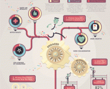
Inspiration at Work
visualized by: Jess3
Either being a business owner wearing all the hats or even a HR Manager animating the spirits in a big organization this nifty graph comes to remind you the significance of moving the cogs to the right direction and make the human engine tap into inspiration, creativity and productivity. It’s a win-win senario.
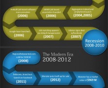
Job Board Chronicle
visualized by: Graphs.net
See the evoloution of job boards over time, the milestones and turnovers happened throughout the various development phases on this “worm” like timeline. Following to their history you’ll find interesting statistics from the job board industry that justify their efficacy in bringing employers and job seekers together.
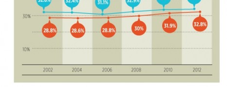
American Employee Loyalty
visualized by: Rasmussen College
How long can you stand drinking from the same wellspring? This study examines the changes in American employee tenure length by gender, ethnicity and industry over the last decade as reported by the US Bureau of Labor.
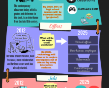
The Future Labor
visualized by: Quib.ly
Are our education systems capable of preparing the workforce of the future? Where are labor relationships heading? Discover some interesting thoughts on conception gaps that technological evolution brings in.
Nasty Jobs that Pay
visualized by: toPRNtoBSN.com
Would you stand to take on any of these 10 nasty jobs? If so, for how long? Nice illustrations packed with hilarious conclusion at the end of the graphic.
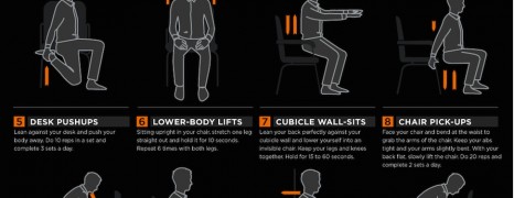
Working Out In The Workplace
visualized by: KT TAPE
Staying fit should always be a priority. See here helpful tips for exercise in your cubicle to keep your body along with your brain.
")